Vinyl #9, 1981
next -->
|
|
|
|
|
Vinyl #9, 1981 |
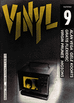
Nevertheless, the magazine became more popular and changed its look every now and then to reach a broader audience. Experimentalism slowly turned into sustainability. Through the years I designed three logos to be used on the cover. The first was a stencil, taken from a manually cut and sprayed alphabet, the second was a constructed adaption from it. After a while I did not like it so much. Somehow it wasn't accessible to the growing group of readers. I had to change it.
next --> |
|
©1995 TYP/Typografisch Papier and the author
|