Exiting stories by uncle Max: The logo, part 3.
4/4__________________________________________________
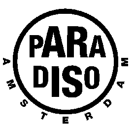
Meanwhile the staff didn't changed their minds about the low profile letterhead and in the end we just gave up. After a while the P somehow bothered the signs of the times and I wanted something more updated. With the second Tegentonen poster I introduced a kind of 'rubberstamp' logo.


<-- back to start

No logos no more.

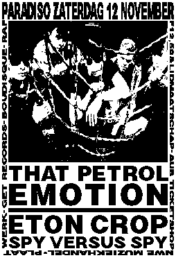
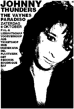
But this logo wasn't used everytime anymore for all posters. The P was not completely off and every now and then used together with the 'rubberstamp'. But more and more we just spelled the name in any suitable typeface for a particular poster, asuming that the poster itself expressed enough identity of the Paradiso.

_____________________________________________________

TYP 3.0 FRONT

©1996 TYP/Typografisch Papier and the author