

Piet Zwart?
|
|
|
Piet Zwart? |
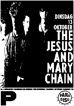
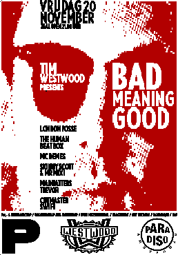
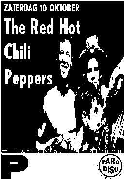
| Although we discussed several times the introduction of a new letterhead design the staff of Paradiso refused to have a high brow profile in their correspondance. The wanted to keep their low profile letterhead - once made by some printer - which expressed in a non pretentious manner the atmospher of a meeting center of youth. Nevertheless we, as designers, were looking for a symbol to give the posters an extra recognizable element to identify the posters as from Paradiso. |
I found a big fat P in a catalogue of wood type, The kind of P which reminds of the 'Piet Zwart' logo (see 'Do you get it?' in TYP 1.0), but much rougher. The rest of the name was added in letters of a very narrow and slim typeface, and the logo was placed over the width of the bottom of every poster.
Because of esthetical and and other vague design reasons the 'rest of the name' was dropped a while later. It turned out that the P on its own - placed in the lower left corner - branded the posters enough.
next --> |
|
©1996 TYP/Typografisch Papier and the author
|